Sign colour: how to choose it

The colour of an outdoor advertising sign: how to choose it and what you need to know.
To make ordering your future sign as easy as possible, we have gathered some facts and tips on colour theory to guide you. After all, a well-chosen font is only half the battle. It is just as important to find a colour scheme that catches the eye of potential customers.
It is the colour of an advertising medium that does the job of attracting customers. Colour is a key factor in selling, because people notice the colour of an object first and only then its shape.
So don't underestimate how colour affects perception: every colour triggers certain associations and emotions. One irritates, another soothes. Colour can make letters sharper and more expressive, or blur them into a single faceless mass.
Colour harmony: where to start?
Since the study of colour goes back centuries, there is no need to reinvent the wheel. You can safely build on J. W. Goethe's original theory of colours and the conclusions of Dr T. König, who analysed the psychology of advertising, including how it is perceived visually. Between them they systematised what is known about the most harmonious colour combinations.
The well-known colour wheels are always there to help: a visual aid that shows how colours relate to, interact with and suit each other. Such wheels (e.g. Goethe's colour wheel or Johannes Itten's colour wheel) are used in practice by visual merchandisers, designers, fashion designers and creative people in general.
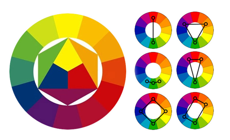
All colours can be divided into the following groups (some strict, some loose):
- Achromatic – white, black and grey.
- Chromatic – all the colours of the spectrum with their shades and gradations.
- Primary – the basis of all colours, three colours: red, yellow and blue.
- Secondary – made by mixing two primary colours.
- And tertiary: a primary plus a secondary colour.
- “Warm” (red, orange, yellow) and “cool” (blue, light blue, violet). But note: the same colour can “change temperature”, looking warmer or cooler depending on the background
- “Light” and “heavy” = pale and dark, determined by the intensity of the colour (dark colours always look heavier than pale ones).
- “Advancing” and “receding”, determined by hue. “Warm” colours always come forward, while “cool” ones do the opposite.
A colour's advancing or receding quality also determines how noticeable it is, i.e. its ability to attract and hold attention, seeming to move closer to the viewer and even creating a 3D effect.
According to the aesthetic principles of the colour wheel, complementary colours – those that sit opposite each other – make a very striking combination. And since a sign mainly consists of a background and lettering that a potential customer must be able to read easily, we suggest you try playing on the contrast between individual colours, for example:
- red and green;
- violet and yellow.
Such colours do not merge visually and are very easy to read, as are, for example, combinations within the “warm” group:
- red and yellow;
- red and green.
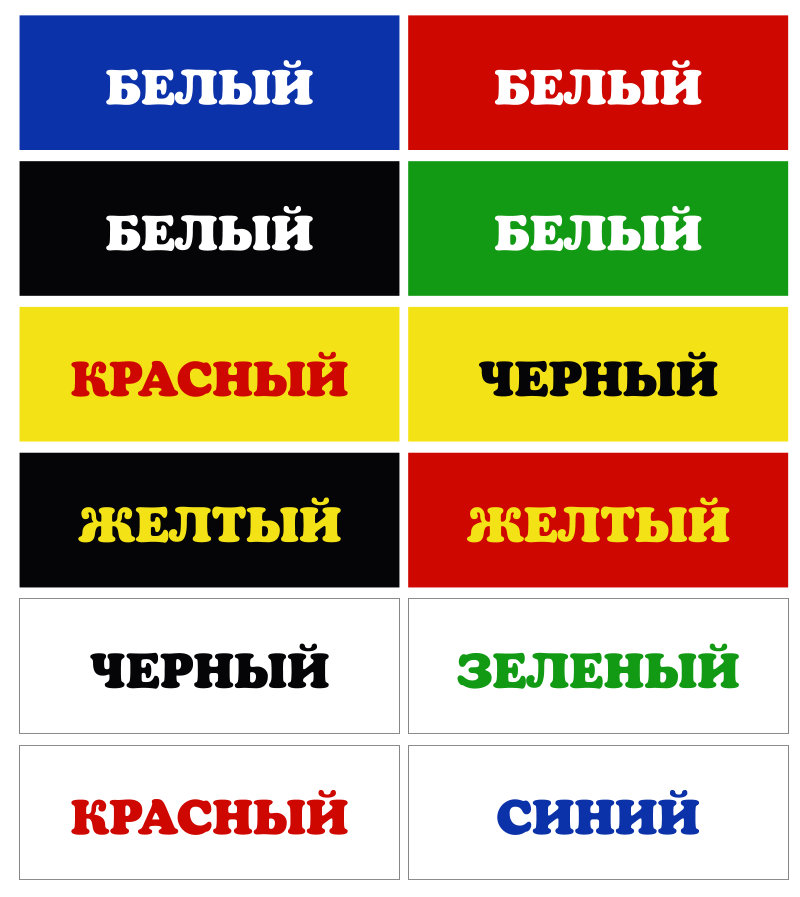
Table of the most contrasting letter and background combinations according to T. König:
The least harmonious colour combinations for a sign also include:
- violet and green;
- violet and red;
- blue and violet;
- green and blue;
- blue and red;
- orange and yellow;
- red and yellow;
- red and orange.
We advise against these, as the human eye finds them hard to read.
In his book “The Psychology of Advertising”, T. König names these colour pairs as the most effective:
- violet + orange;
- yellow + blue (purple);
- red + dark blue.
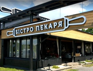
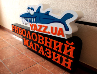
Examples of signs by RVK Tashuta in different colour combinations:

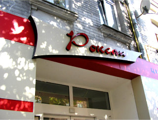
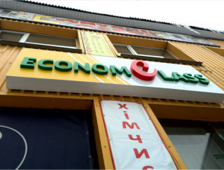
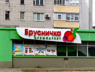
How colours interact. Our recommendations
Colours placed in the same composition can either neutralise or reinforce each other. There are certain patterns, such as:
- A light background makes any darker colour look even darker, and vice versa.
- Red looks more saturated next to green.
- Any colour placed on a background of the same but more saturated hue (from the same palette) loses its saturation (e.g. bright yellow looks pale against hot yellow). That is why we don't recommend choosing colours from the same palette for a sign.
- When an achromatic colour such as grey is surrounded by a chromatic one such as red, its properties change. In this case it takes on a greenish tinge. On a yellow background it looks bluish, on green – pinkish.
Chromatic and achromatic tones also have their own harmonious combinations:
- “warm” colours (yellow, red, orange) + black;
- “cool” colours (light blue, blue, violet) + white.
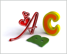
As a visual example, in the picture below we have ranked what we consider the best and most noticeable combinations of contrasting colours in descending order (from worst to best).

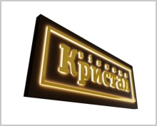
Lighting a sign (e.g. with illuminated letters) matters too. When lit, reds become lighter, cool colours darker, and bright yellows are hard to tell apart from white.
A little about the psychology and symbolism of colour
Whatever angle we analyse the colour family from (“colour and space”, “colour and form”), “colour and people” remains the fundamental one. It rests on stable shared associations and symbolic meanings that are the same for most people around the world. In brief, they can be interpreted as follows:
• Red is quite contradictory: on the one hand irritating and rather alarming, on the other romantic. It is associated with love and passion, with blood and war. One of the royal colours, serious and majestic, highly energetic, bold and eye-catching.
• Orange brings a sense of celebration, fills you with enthusiasm and warmth, and is associated with the sun. A close relative of yellow. Dynamic, sensual, life-affirming and lavish. The recognised colour of Buddhism, standing for the renunciation of vices.
• Yellow is the brightest and most optimistic member of the light family. The cheerful colour of sunshine, hope, fun, vigour, friendliness, smiles and carefree living. It always evokes warm, pleasant associations. Mixed with red or brown it gives gold – the colour of regal luxury, wealth, glory and victory.
• Green is the colour of comfort and balance, harmony, safety and health (no wonder pharmacy crosses are green). The most common colour in nature, associated with youth, renewal, spring, lush vegetation, fertility and rest. In yoga and esotericism it is the colour of life energy (prana), which fills the whole universe though invisible to the eye.
• Blue (and light blue) is the colour of the sky and sea, relaxation, reliability, trust and wisdom. The most calming colour for the mind and emotions. It symbolises peace and serenity; the colour of winter and cold, eternity and constancy, stability and strength. One of the royal colours.
• Violet, at the end of the spectrum, is a mixture of red and blue, so it combines anxiety and calm. That is why it symbolises the unity of opposites. In ancient times it was considered the colour of those initiated into secret knowledge. A spiritual colour of transformation and all things mysterious. It puts you in a philosophical mood and has a calming effect.
In conclusion
Even with all of the above in mind, we strongly advise you not to chase a colour scheme just because it looks nice. Everything has to fit.
The colours of your sign should match those set out in your brand book, if you have one.
If you don't, approach the question carefully, taking into account the surroundings, the architectural style of the building and the overall message the sign should convey. After all, its main job is to build your image and boost sales.
So don't worry: we will help you decide and suggest the best solution, including the colour scheme!





-
![About us]() About us
About us
-
![Contacts]() Contacts
Contacts
-
![Payment]() Payment
Payment
-
![DELIVERY]() DELIVERY
DELIVERY
-
![Gallery]() Gallery
Gallery
-
![For designers]() For designers
For designers
-
![Print-ready artwork requirements]() Print-ready artwork requirements
Print-ready artwork requirements
-
![Aluminium composite colour range]() Aluminium composite colour range
Aluminium composite colour range
-
![Chipboard colour palette in stock]() Chipboard colour palette in stock
Chipboard colour palette in stock
-
![Artwork approval rules]() Artwork approval rules
Artwork approval rules
-
![LED neon colours]() LED neon colours
LED neon colours
-
![Artwork design]() Artwork design
Artwork design
-
![RAL colour chart]() RAL colour chart
RAL colour chart
-
![Pantone colour chart]() Pantone colour chart
Pantone colour chart
-
![Series 641 – economy]() Series 641 – economy
Series 641 – economy
-
![Altuglas coloured acrylic palette]() Altuglas coloured acrylic palette
Altuglas coloured acrylic palette
-
![Two-layer plastic colour palette]() Two-layer plastic colour palette
Two-layer plastic colour palette
-
![Useful articles about advertising]() Useful articles about advertising
Useful articles about advertising
-
 About us
  Company documents
  Contacts
  Payment
  DELIVERY
  Gallery
  For designers
  Print-ready artwork requirements
  Aluminium composite colour range
  Chipboard colour palette in stock
  Artwork approval rules
  LED neon colours
  Artwork design
  RAL colour chart
  Pantone colour chart
  Series 641 – economy
  Altuglas coloured acrylic palette
  Two-layer plastic colour palette
  Useful articles about advertising