How to choose the right font for an outdoor sign

There are a number of universal, well-established rules and recommendations that answer this question. And it makes absolutely no difference what kind of premises you are ordering a sign for (a café, a restaurant, a shopping centre, etc.).
Either way, you first need to be clear about what the font is meant to achieve. We would single out 3 goals:
- To be original and attract attention.
- To help build and maintain the image of the advertised company.
- To decorate the premises.
In our experience, most customers state their preference straight away and point to a particular font. But our designers also have their own collection of fonts that they will be happy to offer you.
Based on the golden rules of making signs of any size (e.g. banners or 3D letters), we recommend using 2 fonts, which must:
- go well together;
- be easy for the human eye to read;
- match the customer's corporate identity.
More than two fonts create a typographic hotchpotch that scatters a potential customer's attention.
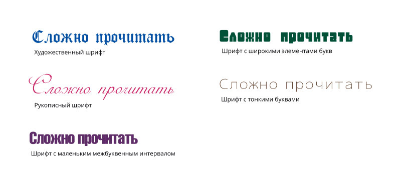
WE DO NOT RECOMMEND hard-to-read fonts for signs, for example
- artistic (display) fonts;
- handwritten (calligraphic) fonts;
- fonts with wide characters;
- fonts with thin characters;
- fonts with tight letter spacing and small counters.
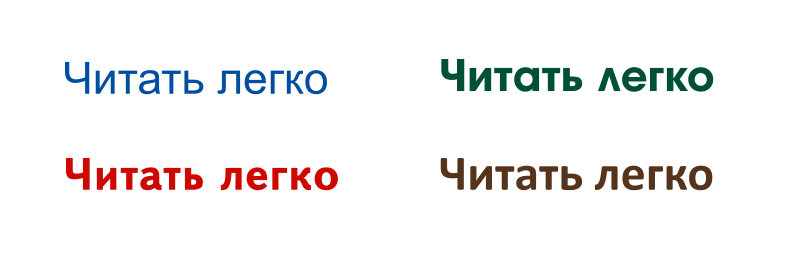
WE RECOMMEND simple, legible fonts for sign making:
- poster-style fonts; • with medium contrast;
- with good sharpness and weight;
- in a simple “Normal” style.
From a professional point of view, there are three types of fonts, each with its own features and its own way of being perceived by the human eye. It is worth knowing them and taking them into account when ordering an advertising sign. So let's look at this in more detail.
Serif fonts (“antiqua” or “roman” fonts)
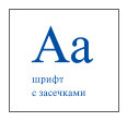 The classics of typography! The well-known Times New Roman, Bodoni and Garamond are the most popular fonts in this category, which in Western countries is simply called “serif”. Serifs are short strokes added at right angles to the ends of letters, starting and finishing the main strokes of the characters.
It is fair to say that serif fonts look more stable (as if standing on a base) and therefore more formal (they suit historic buildings and architectural monuments). That is why they are popular with our customers from public institutions who order signs (e.g. 3D letters for a building façade).
Serifs make a font more legible and easier to take in visually, as if linking the letters and lining them up in a single row. Printed text like this is much easier to read, especially in large blocks, because the serifs act as pointers guiding the eye along the lines.
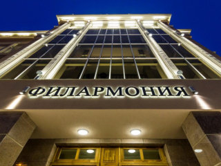
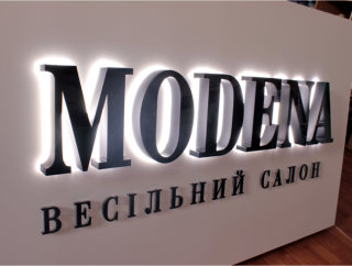
Making signs with serif fonts
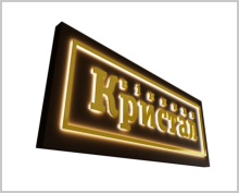
Note that illuminated 3D letters with serifs are harder to make than letters in sans-serif fonts, which is why they cost more. It is difficult to reduce the letter spacing, and it is not easy to light the serifs evenly.
But you can rely on RVK Tashuta: we will offer you the best option even in the trickiest cases.
Sans-serif fonts (“grotesque” or “gothic” fonts)
 These fonts have strict geometric shapes and, as you will have guessed, their letters have no serifs. Typical examples are Calibri, Arial and Helvetica.
In English they are called “sans serif”, in German “grotesk”, and in American usage “gothic”. Their main and connecting strokes are often of the same thickness, so sans-serif fonts look clean, concise and bold.
Grotesque fonts are very easy to read as a whole and look modern. Designers love working with them, too. Without serifs, letter spacing can be adjusted with no trouble.
Glossy magazine headlines and advertising materials can't do without sans-serif fonts – let alone outdoor and indoor signs.
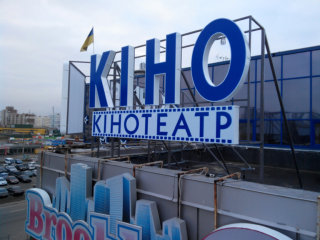
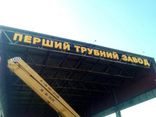
Sans-serif fonts are ideal for modern architecture (shopping centres, bars, clubs, etc.). Grotesque fonts work well for freestanding illuminated letters mounted on a building façade.
Decorative fonts (handwritten and display)
The artistic look of the font chosen for a sign can easily convey the style of the venue itself. These fonts let you be original and come to the rescue when you need an image-building element that makes the company recognisable.

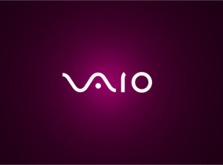
This group includes various kinds of italic, which softens any lettering and makes it more elegant and even festive. Naturally, imitation handwriting makes such a sign stand out from the rest and draws the attention of potential customers.
We won't hide the fact that the human eye reads decorative fonts less easily and quickly than fonts of the categories above. But if you weigh up the benefits: the Coca-Cola name written in an ordinary font would not be so recognisable all over the world.
Lower-case and capital letters on a sign. How they are perceived
If the lettering uses lower-case letters, it should start with a Capital.
For lettering in CAPITAL letters, serif and sans-serif fonts work best. But remember that in this case the letter spacing needs to be increased to make the sign easier to read. Otherwise all the letters will merge into a single faceless mass.
But every case is different. So the size and style of the letters depend on the size of the space where the sign will be placed.

Horizontal and vertical alignment of lettering
If the lettering on your sign consists of two lines set in the same font and the same size, the letter spacing should be the same.


In a vertical layout, letters arranged parallel to the wall from top to bottom are easier to read. When the letters are perpendicular, it is better to read from bottom to top

Line spacing
For single-line lettering we recommend using one font in one point size. If the lettering is split into two or more lines, you can – and ideally should – use 2 fonts: that way it looks pleasant, concise and out of the ordinary. For harmonious proportions, the line spacing should be 1.25 to 1.5 times the height of the lower-case letters.

Font and building style
It is very important that the font of your future sign suits the exterior or interior of the building where it will be placed and doesn't look like lace on a tank. The artistic character of the font (monumental, decorative, italic, etc.) should match the architecture of the building.
Of course, nobody can stop you choosing whatever font you like. But if you care about your town and an aesthetically pleasing urban environment, you need to approach the question very thoroughly, sometimes even sacrificing personal preferences for the sake of matching shapes and proportions.

To sum up
However many tips and rules we have given in this article, remember: you don't have to follow them all. Every case has its own nuances, as it depends on many factors, including the budget and the design features of your order. To make your choice easier, go straight to the specialists at RVK Tashuta, who have projects of every level of complexity and scale behind them. We will help you get your company noticed and do our best to make a signage piece that does your image justice and that you will be happy with.
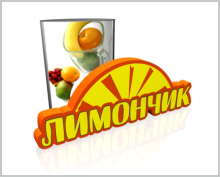
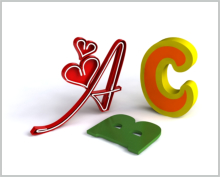
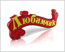



-
![About us]() About us
About us
-
![Contacts]() Contacts
Contacts
-
![Payment]() Payment
Payment
-
![DELIVERY]() DELIVERY
DELIVERY
-
![Gallery]() Gallery
Gallery
-
![For designers]() For designers
For designers
-
![Print-ready artwork requirements]() Print-ready artwork requirements
Print-ready artwork requirements
-
![Aluminium composite colour range]() Aluminium composite colour range
Aluminium composite colour range
-
![Chipboard colour palette in stock]() Chipboard colour palette in stock
Chipboard colour palette in stock
-
![Artwork approval rules]() Artwork approval rules
Artwork approval rules
-
![LED neon colours]() LED neon colours
LED neon colours
-
![Artwork design]() Artwork design
Artwork design
-
![RAL colour chart]() RAL colour chart
RAL colour chart
-
![Pantone colour chart]() Pantone colour chart
Pantone colour chart
-
![Series 641 – economy]() Series 641 – economy
Series 641 – economy
-
![Altuglas coloured acrylic palette]() Altuglas coloured acrylic palette
Altuglas coloured acrylic palette
-
![Two-layer plastic colour palette]() Two-layer plastic colour palette
Two-layer plastic colour palette
-
![Useful articles about advertising]() Useful articles about advertising
Useful articles about advertising
-
 About us
  Company documents
  Contacts
  Payment
  DELIVERY
  Gallery
  For designers
  Print-ready artwork requirements
  Aluminium composite colour range
  Chipboard colour palette in stock
  Artwork approval rules
  LED neon colours
  Artwork design
  RAL colour chart
  Pantone colour chart
  Series 641 – economy
  Altuglas coloured acrylic palette
  Two-layer plastic colour palette
  Useful articles about advertising