Fonts with Cyrillic support for neon lettering




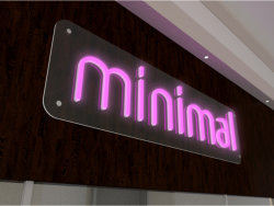
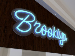
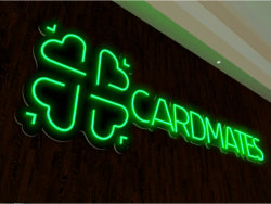

Neon lettering always looks unusual and atmospheric, sparking fantasies and thoughts of the future, of entertainment and more. Neon lettering motivates and calls to action; people put it on the wall at home, in a café, bar or office.
How do you choose a font for neon so it looks stylish and modern?
Neon fonts fall into 3 types:
- script (handwritten)
- print (block) letters
- multi-line fonts
Under each example there is a link to download the font.
Script fonts
For script lettering, it is best to choose fonts with a continuous line. A continuous font is cheaper and easier to make. It also makes the lettering look the most unified.
The whole inscription does not have to be a single line, but pay attention to the joins between letters. Ideally, they should flow smoothly into one another.


Print fonts


Line fonts





-
![About us]() About us
About us
-
![Contacts]() Contacts
Contacts
-
![Payment]() Payment
Payment
-
![DELIVERY]() DELIVERY
DELIVERY
-
![Gallery]() Gallery
Gallery
-
![For designers]() For designers
For designers
-
![Print-ready artwork requirements]() Print-ready artwork requirements
Print-ready artwork requirements
-
![Aluminium composite colour range]() Aluminium composite colour range
Aluminium composite colour range
-
![Chipboard colour palette in stock]() Chipboard colour palette in stock
Chipboard colour palette in stock
-
![Artwork approval rules]() Artwork approval rules
Artwork approval rules
-
![LED neon colours]() LED neon colours
LED neon colours
-
![Artwork design]() Artwork design
Artwork design
-
![RAL colour chart]() RAL colour chart
RAL colour chart
-
![Pantone colour chart]() Pantone colour chart
Pantone colour chart
-
![Series 641 – economy]() Series 641 – economy
Series 641 – economy
-
![Altuglas coloured acrylic palette]() Altuglas coloured acrylic palette
Altuglas coloured acrylic palette
-
![Two-layer plastic colour palette]() Two-layer plastic colour palette
Two-layer plastic colour palette
-
![Useful articles about advertising]() Useful articles about advertising
Useful articles about advertising
-
 About us
  Company documents
  Contacts
  Payment
  DELIVERY
  Gallery
  For designers
  Print-ready artwork requirements
  Aluminium composite colour range
  Chipboard colour palette in stock
  Artwork approval rules
  LED neon colours
  Artwork design
  RAL colour chart
  Pantone colour chart
  Series 641 – economy
  Altuglas coloured acrylic palette
  Two-layer plastic colour palette
  Useful articles about advertising